
uhliuhcuh
Design, Illustration, Typography and Layout
A personal project to update the packaging of the sugar Dr. Pepper cans.
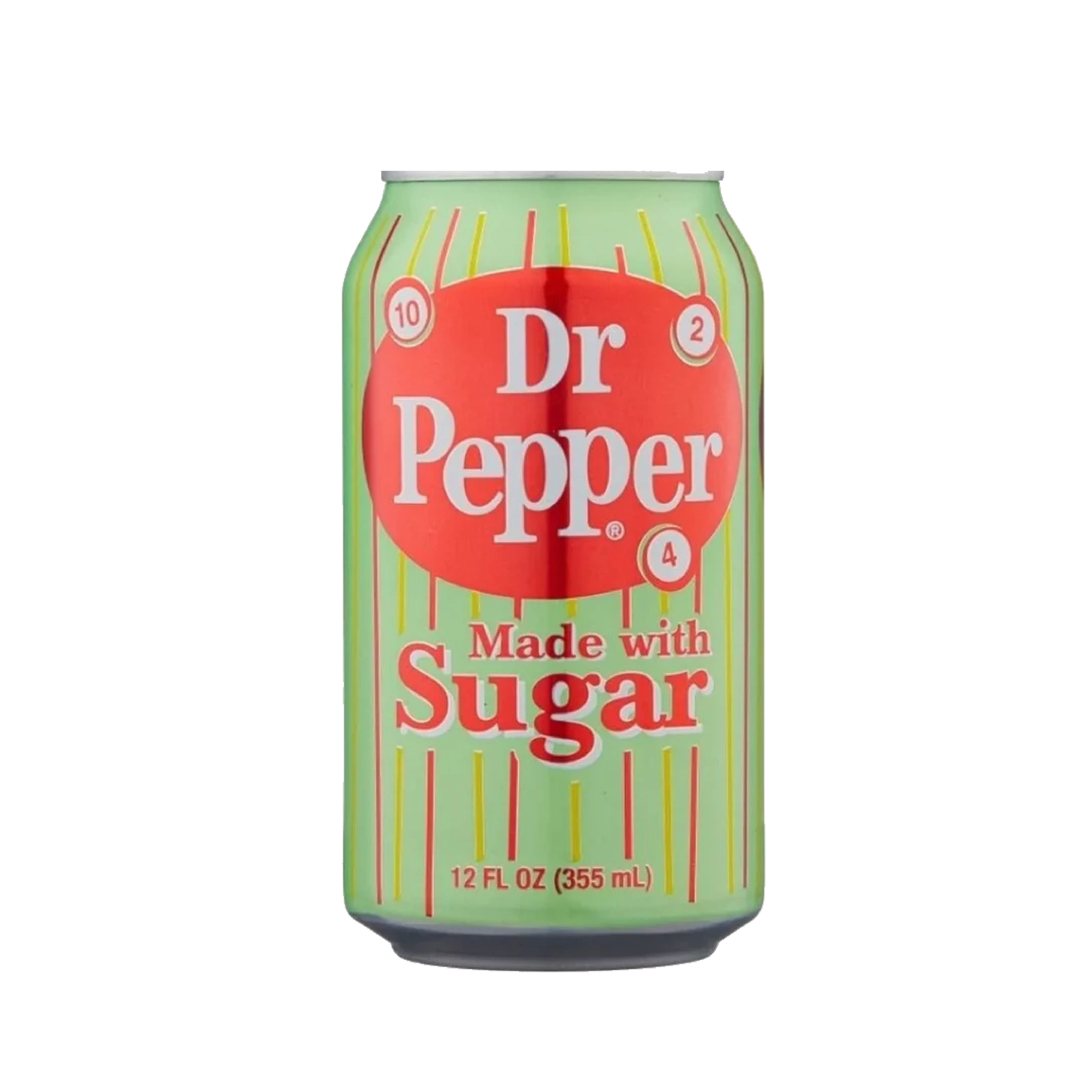
While I liked the green color of the original can, the design seemed more of an attempt at retro then authentic retro.
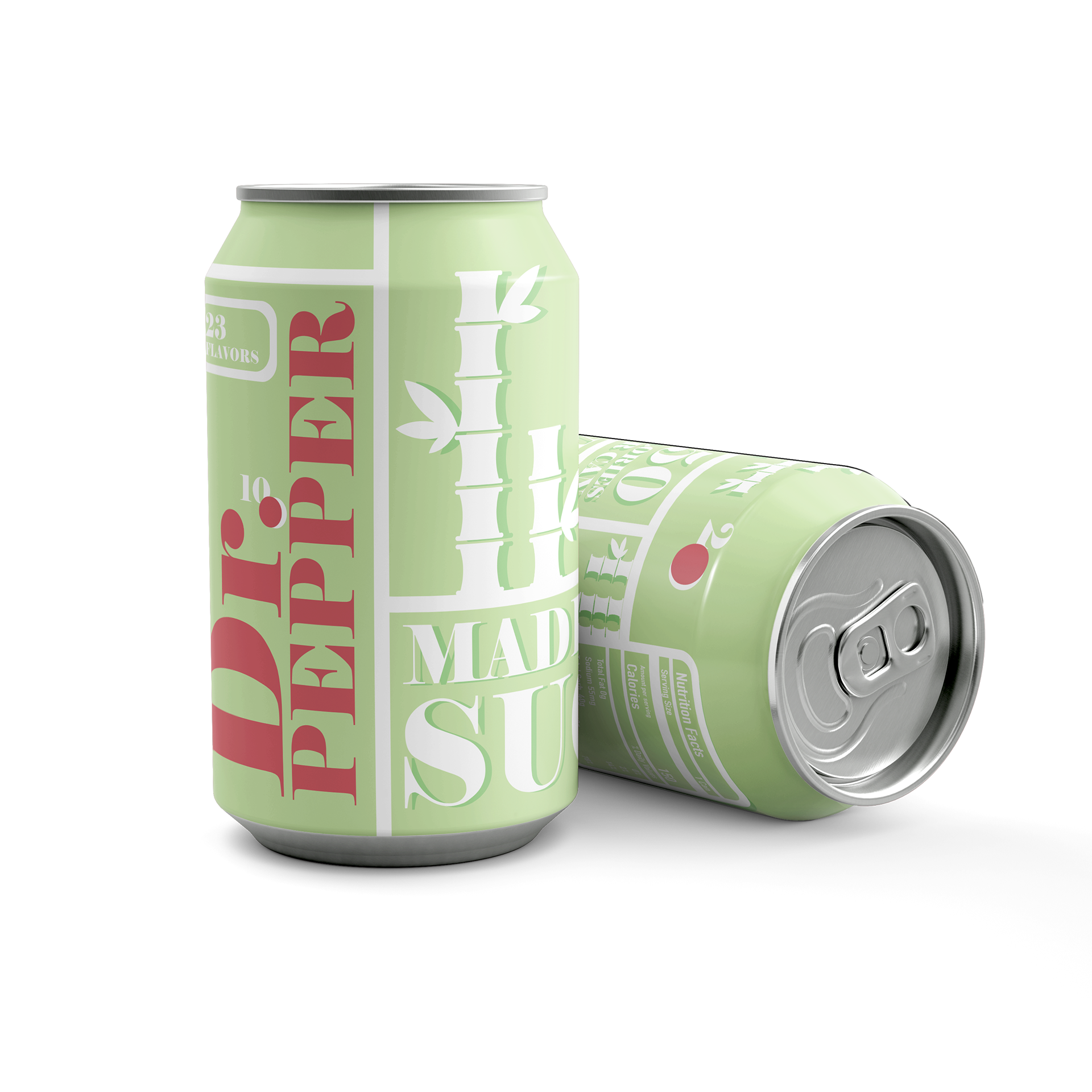
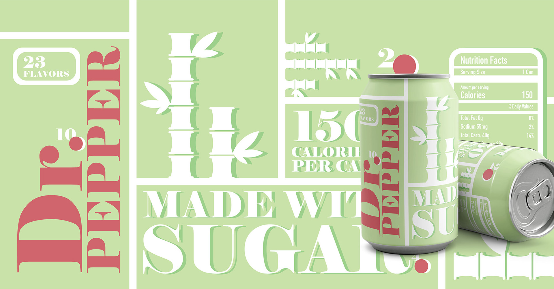
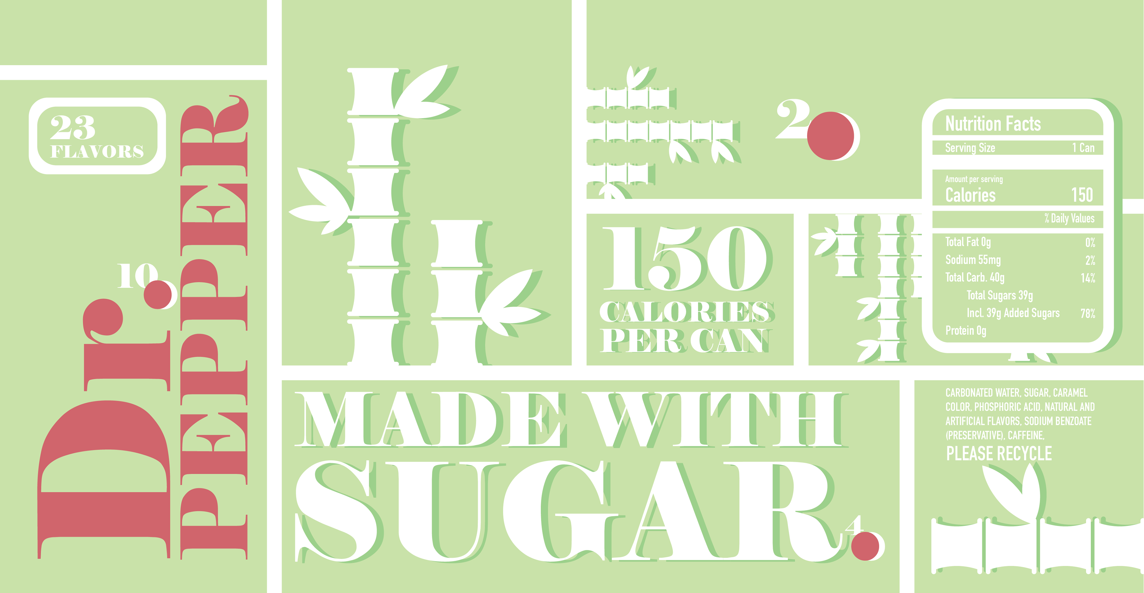
For my design I wanted a more modern look with a more visual call out to the highlighted ingredient, which is the sugar. Although, The Dr.Pepper 10, 2, and 4 imagery did make an appearance within the redesign as I felt that it is a classic staple of the brand.
Original
Redesign